Civic services
Dubai Municipality: turning nine city apps into one
Dubai Municipality had nine separate apps, each with its own way of working. As lead designer, onsite for 11 months, I designed the one app that replaced them, in Arabic and English, on a low-code platform.
9 appsbrought into one, with one sign-in, one search and one dashboard
I was handed one screen before the whole picture
In my first days at Dubai Municipality, onsite in Dubai, I was asked to design a dashboard. The brief was simple, and I knew it was also a test of what I could do. What I didn't have yet was the whole picture.
The Municipality had nine separate apps, and each one came from a different part of the organization. Dubai 24/7 took complaints and requests, Green Ticket booked visits to service centers, Montaji checked consumer products, Dubai BPS tracked building permits, and the rest covered Al Mamzar Beach Park, parks and beaches, Dubai Frame, the Quranic Park and a dictionary of local Arabic terms.
Diagram · nine apps, one app
So before I could design one dashboard for all of them, I had to understand every one of them.
Getting that understanding took time. Every app had its own stakeholders and its own documents, so I went app by app. I spoke with each department's stakeholders, read the documents they had, and gathered the details one piece at a time.
What I found was that the nine apps had nothing in common. Each had its own screens, its own way of doing things and its own idea of what a user needed. There was no shared pattern to build on, so the common structure was something I had to design from scratch.
Many structures before five tabs
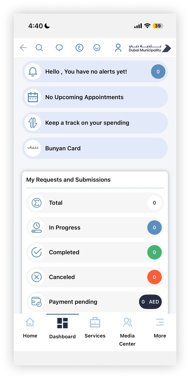
I tried a lot of structures for the app before one held up. The one that worked has five tabs: Home, Dashboard, Services, Media Center and More.
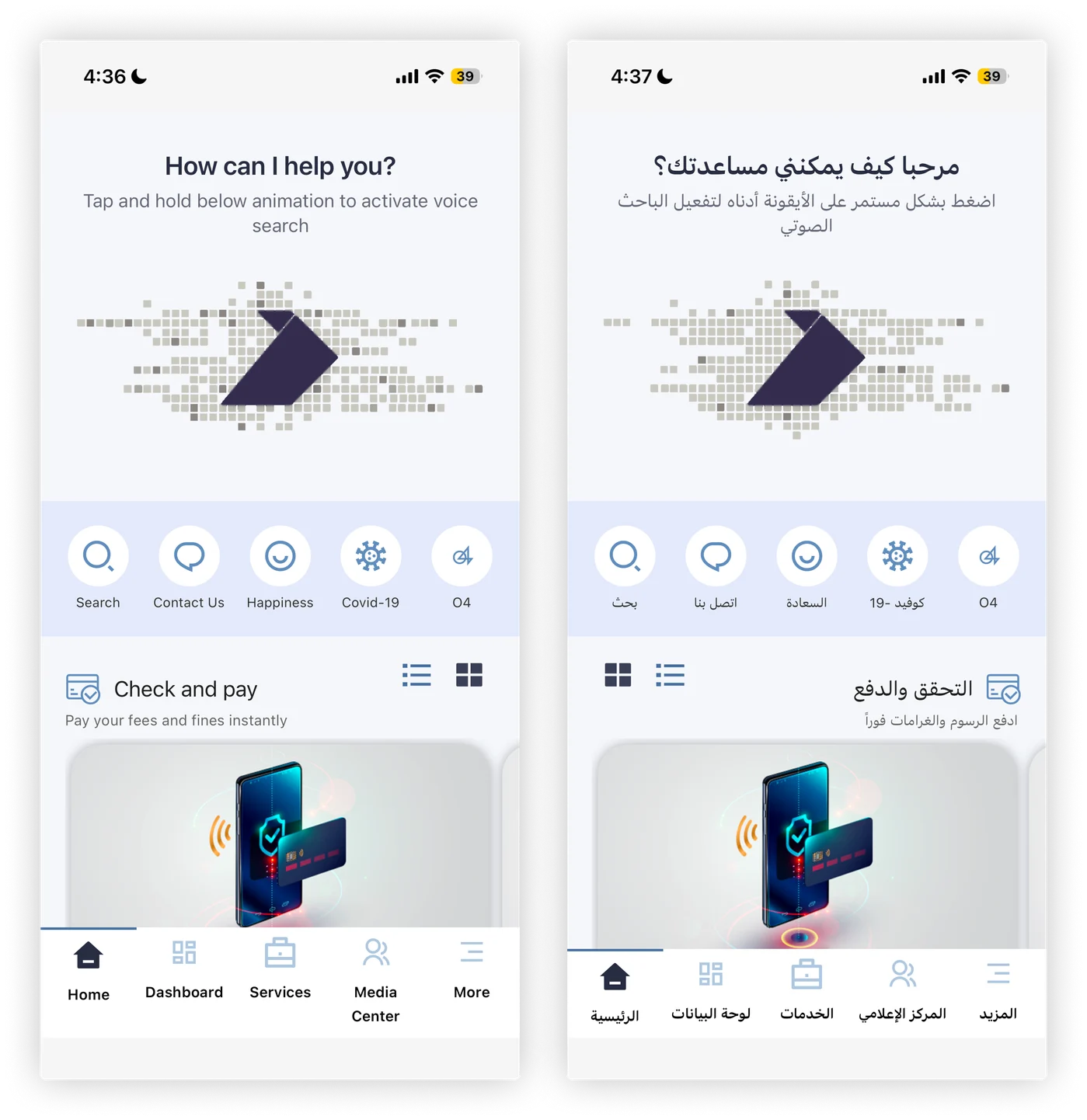
Dashboard grew out of that first test. It's one place for alerts, appointments and spending, and for every request a person has made, whether it's in progress, completed, canceled or waiting for payment. Home opens with 'How can I help you?' and a voice search. The voice search was the client's idea, and my job was to make it work as the front door of the app.
I let the stakeholders build the groups
The hardest part of the structure was the services. There were a lot of them, coming from nine apps and many departments, and every department had its own view of where its services belonged.
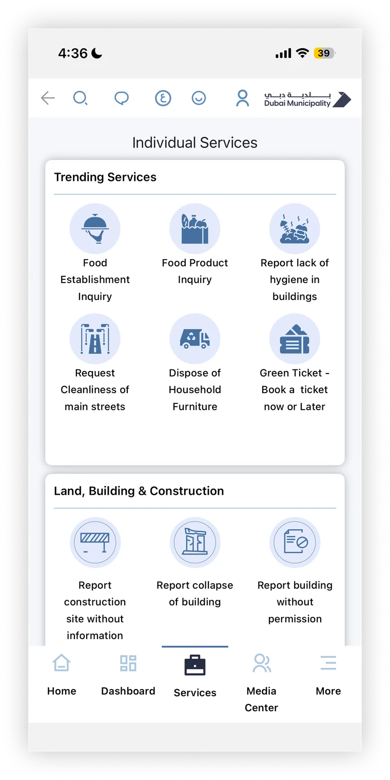
So instead of deciding the groups on my own, I ran a card sorting workshop. I brought a few stakeholders together, gave them the services as cards and asked them to place each card in a section. The logical groups came out of that exercise, and it helped a lot on the business side, because the groups came from the stakeholders themselves.
Diagram · the card sorting workshop
Today the Services tab opens with trending services and then groups the rest by topic, like Land, Building and Construction.
Designing within a low-code platform
The app was built on a low-code platform, and it came with a lot of limits. It restricted the layouts we could use, it couldn't bring in things like maps, image imports were limited, and so was the styling.
So a big part of my job was designing workarounds the developers could actually take in. Animation is a good example. The platform couldn't handle it, so I made the animations myself as SVG files and handed those over, and the app could use them as they were.
Diagram · designing within a low-code platform
One layout for Arabic and English
The app had to work fully in Arabic and English. English was always the primary design, and I set up Arabic as a template. The right-to-left layout followed a rule the developers applied, so I didn't have to redesign every screen for Arabic.
Diagram · one layout, two languages
What shipped
The unified app launched while I was there. Nine separate apps became one, with one sign-in, one search and one dashboard for every request, and Arabic and English on the same layout.
I'm proud of the design and of bringing nine apps into one. The live app has changed since 2020, so what you see today isn't exactly what I designed, and I don't have usage figures from this project.
What I'd do differently
I'd do a lot more research, and with the people the app is really for: the residents and citizens of Dubai, not just the departments. I'd also build it one feature at a time and give each feature enough time to be done properly.