Airline e-commerce
Jet Airways: booking a flight, from fare to payment
Five fares per flight don't fit on a phone.
So on mobile, each flight opens to show its fares as a list.
Booking on web, iOS, and Android, live until the airline closed in 2019
Choosing a fare on a phone
The desktop grid, shrunk
- Five fare columns squeezed side by side
- Prices too small to compare
- No room for seats left or the saving
Tap a flight, then pick a fare
- One flight opens at a time
- Each fare gets a full-width row
- Seats left and the old price sit with the fare
Illustration with demo content, not the airline's screens. The real screens are shown below.
Four years on an airline's booking flow
I worked on Jet Airways' booking for four years, as one of the designers on a larger team. There was no single brief. The work came in pieces, across the whole journey from search to payment.
The journey ran Search, Flights, Guests, Extras and Pay. Each flight came in five fares, plus a business-class option, and meals, seats, baggage and insurance were sold along the way, on web, iOS and Android. People compare fares by price, so every number had to be clear, and the airline needed the extras to sell. This case covers four calls I made along that journey, and other designers on the team owned the rest.
Diagram · one booking, five steps
Design the booking screens.
People compare fares by price, and on a phone the grid made every price too small to compare.
Five fares don't fit on a phone
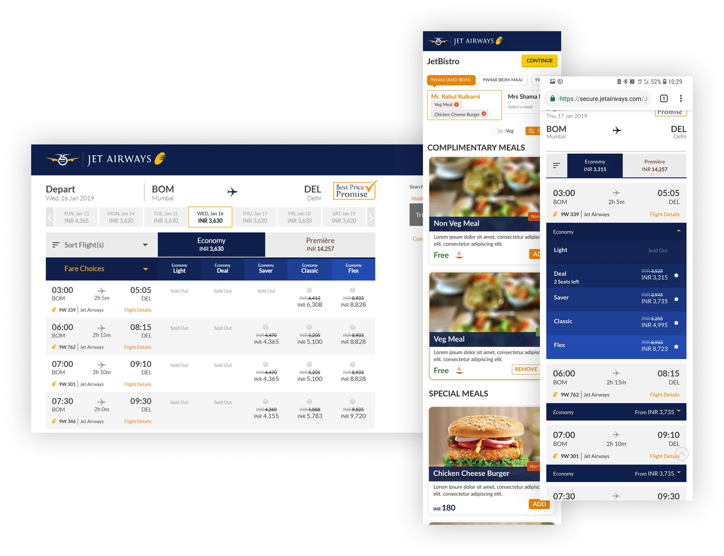
On a wide screen the fare grid works well, and people can compare flights and fares at a glance. On a phone, the same grid turns into five narrow columns, with prices too small to compare and no room for anything else.
So I kept the grid on desktop and turned it into a list on mobile. You tap a flight, it opens, and each fare gets a full-width row with room for its price, the old price and how many seats are left.
Diagram · the two options
I showed the full price, broken down, while people choose
Showing one total would have been simpler, but it also hides what the money is for. So the trip summary sits right next to the fare choice, with the fare, tax, fees and discount each on a line of its own. People see what they'll pay before they move on, and the total at payment isn't a surprise.
Diagram · the two options
Every add-on in one step before payment
Each add-on could have had its own step, or popped up somewhere along the way. Instead I put meals, seats, baggage, priority, miles and insurance into one Extras step just before payment, so people see every add-on once, pick what they want and move on.
Meals are chosen per passenger and per flight, with filters like veg, hot meals and snacks.
Diagram · the two options
The business-class offer sits inside the fare choice
Upgrades are often sold with a pop-up that interrupts you mid-choice. I put the offer under the chosen fare instead, showing what it adds and how much more it costs, in the same terms people were already comparing. Saying no takes no extra click.
Diagram · the two options
What shipped
The booking flow shipped on web, iOS and Android, built on a shared component library so all three offered the same choices, each laid out for its own screen. It stayed live until the airline closed in 2019.
This was between 2015 and 2019, and I don't have figures from it. What you see here is what we designed and shipped, taken from my own files.
The product
The booking flow, as shipped
On desktop, flights are rows and the five fares are columns. Pick a fare and the trip summary beside it breaks the total into fare, tax, fees, and discount. The business-class offer sits under the chosen fare.
What I'd do differently
If I did it again, I'd measure as I went, like how many people picked each fare and how many added extras, so the work could be judged by numbers. And I'd watch people book on a phone, not just review the screens.