Jet Airways: Every Consumer Touchpoint for India's Premier Airline
Over four years I shipped production apps for Jet Airways across six platforms: desktop web, mobile web, iOS, Android, Apple Watch, and a B2B travel agent portal. Every platform was live and in use until the airline ceased operations in April 2019.
6
Platforms shipped to production
4 yrs
All platforms live and in use
2015
Apple Watch app, novel for Indian aviation
B2B+B2C
Separate portals for agents and passengers
The Problem
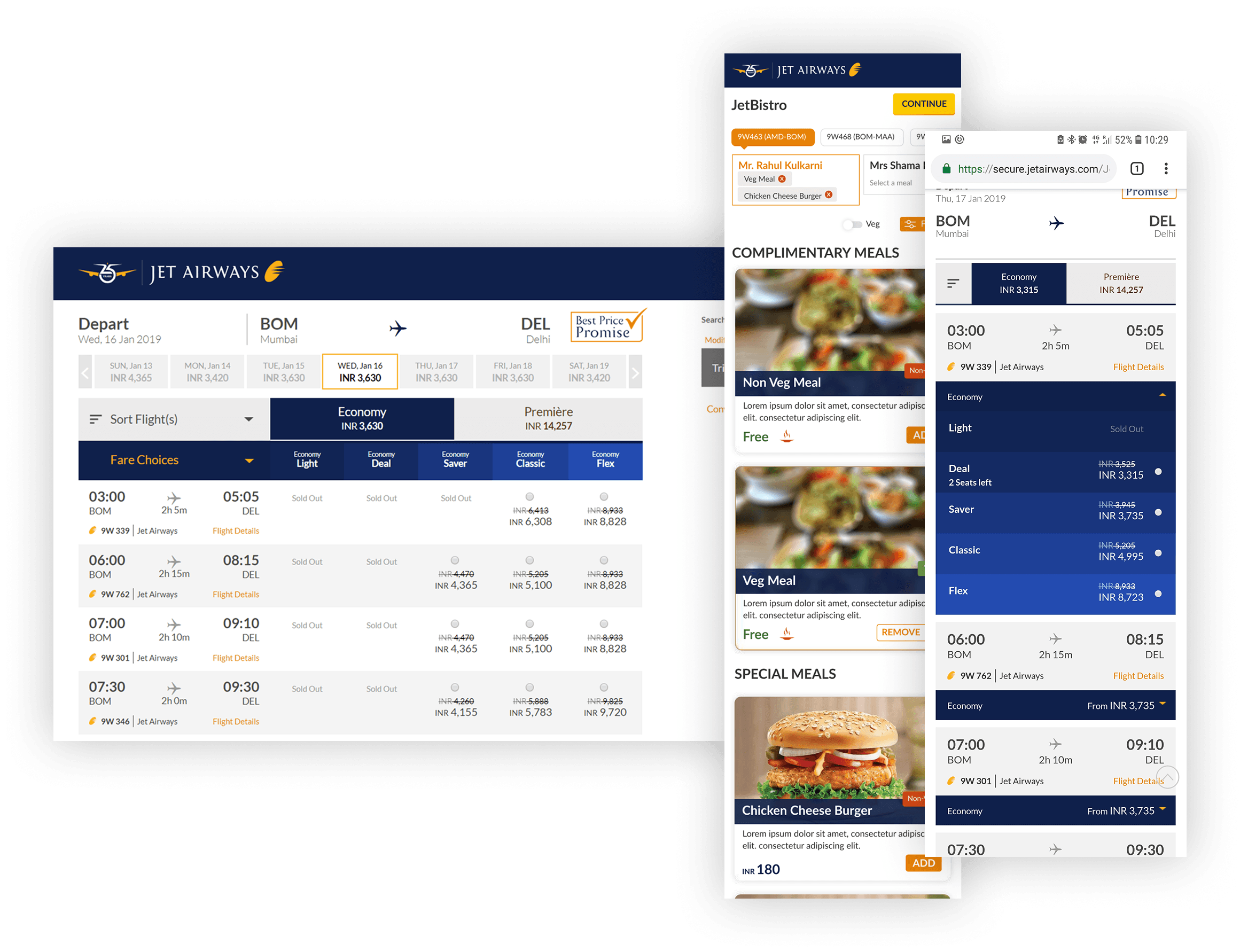
In 2015, Jet Airways had a fragmented digital presence. A passenger booking a flight on desktop encountered a different visual language, different terminology, and different interaction patterns than they'd find on mobile. There was no consistent mental model across touchpoints, just separate products that happened to serve the same airline.
The fragmentation mattered more than a cosmetic inconsistency. A passenger who started a booking on desktop and continued it on their phone would encounter layout shifts, renamed fields, and different confirmation patterns. In aviation, where passengers are anxious about getting bookings right, that inconsistency erodes trust in the platform at exactly the wrong moment.
Simultaneously, Jet Airways served a large B2B travel agent audience, including agencies managing bulk bookings, corporate accounts, and multi-passenger itineraries, whose needs were entirely different from a solo passenger booking a weekend trip. These two audiences needed distinct interfaces sharing the same underlying design language.
My Role
Product Designer responsible for UX and UI across all six platforms. I worked end-to-end, from initial research and information architecture through to final UI specifications and developer handoff. I was part of a cross-functional team that included product managers, backend engineers, and platform-specific frontend developers.
The four-year tenure meant I was present for the full lifecycle of the digital product, from the original iOS app through to the Apple Watch companion — one of the first aviation wearable experiences shipped in India — the B2B agent portal, and the ongoing web platform evolution. I wasn't a consultant brought in for a single platform. I owned the design continuity across all of them.
Key Decisions
Decision 1: Shared component library as the cross-platform foundation
The first structural decision was how to create visual consistency across six platforms without creating six separate design systems. The options were: design each platform independently and enforce consistency through review (slow, fragile), create a single rigid system and adapt it rigidly to each platform (consistent but poor platform fit), or build a shared component library with platform-specific adaptation layers on top.
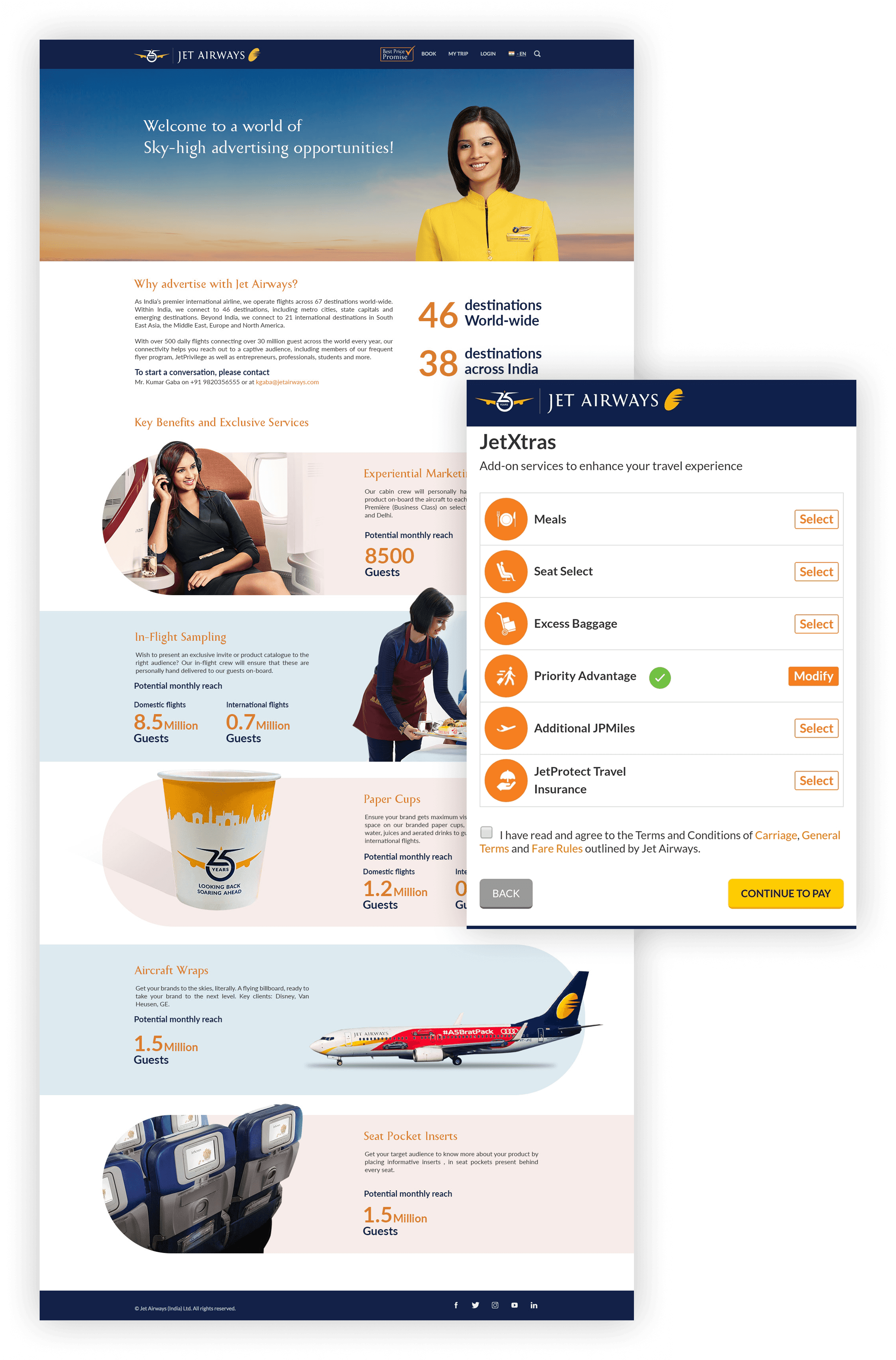
We chose the third approach. Shared foundations, including colour, typography, spacing, and iconography, were defined once. Platform-specific layers then applied the appropriate conventions: iOS navigation patterns for the iOS app, Android material behaviour for Android, responsive breakpoints for web. A passenger moving from the Jet Airways website to the iOS app encountered the same visual language with different yet correct interaction behaviour for each context.
Decision 2: Apple Watch, minimum viable interaction and not a shrunken phone app
Designing the Apple Watch companion in 2015–2016 was genuinely novel. There was no aviation industry precedent for what a watch airline app should do. The naive approach would have been to shrink the iOS app's key screens onto a 38mm display. This is almost always the wrong answer for wearable design.
The right question was: what is a passenger doing with their phone that a watch can do better, or what would they do if they didn't have to reach for their phone? The answer was narrow: boarding pass display at the gate, flight status at a glance, and one-tap check-in confirmation. Everything else, including seat selection, meal preferences, and booking management, stayed on the phone.
Constraining the watch to this minimal surface wasn't a limitation. It was the design. A watch app that tries to do everything a phone does is a worse phone app on a smaller screen. A watch app that does three things perfectly is a genuinely useful wearable experience.
Decision 3: Separate interaction models for B2C passengers and B2B travel agents
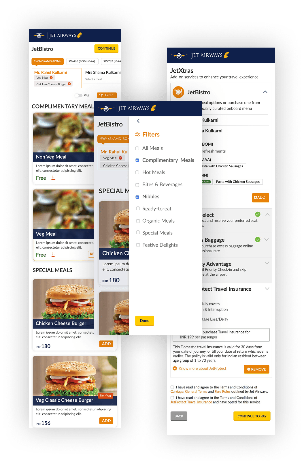
Travel agents have a fundamentally different task model from passengers. A passenger is booking one journey for themselves, often with emotional investment in the trip. A travel agent is managing dozens of bookings simultaneously, across multiple passengers, under time pressure, with no emotional stake in any individual journey.
Designing a single interface that serves both is a category error. The B2C passenger app is focused and linear, guiding one person through one booking with confidence and clarity. The B2B travel agent portal is dense and tabular, enabling rapid switching between bookings, bulk passenger management, and corporate account oversight. The visual language is shared. The information architecture and interaction model are entirely separate.
Decision 4: Responsive web as the canonical design reference
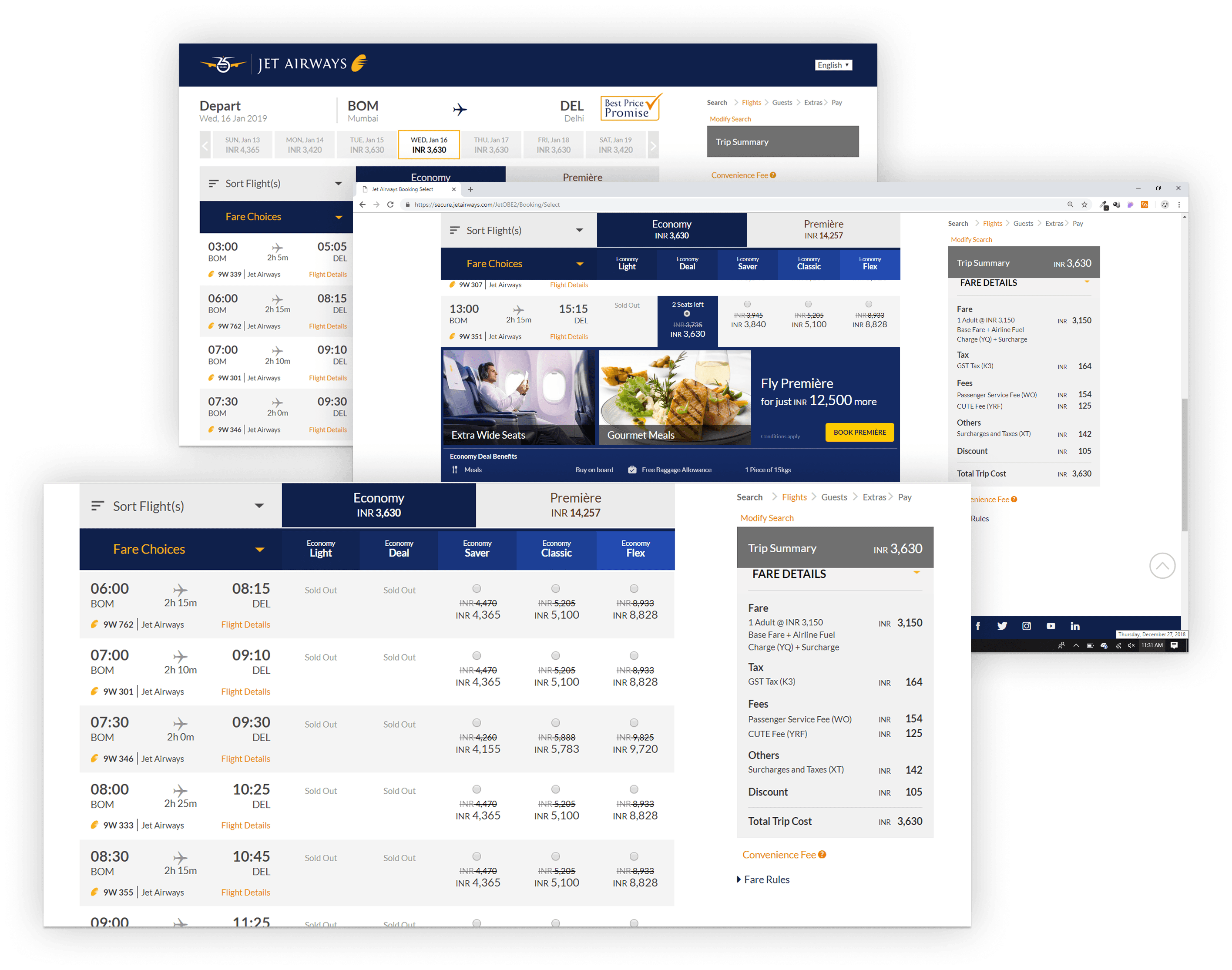
With six platforms, the question of which platform to design first had real consequences for the most complex screens in the product. Aviation UX is information-dense: fare comparison across multiple cabin classes, multi-passenger booking flows, and corporate account management all involve layered data that needs space to breathe. Designing those screens mobile-first would have meant solving them at the smallest, most constrained canvas first. The desktop would then become an inflated mobile layout rather than an interface that uses available space to genuinely reduce cognitive load.
Using responsive web as the canonical reference meant the hardest layout and content problems were solved at full width first, where the information hierarchy could be established clearly. Native iOS and Android then adapted from this reference, applying correct platform conventions without compromising the underlying structure. Consistency wasn't enforced through constant cross-platform review — it was built into the design process from the start.
Results
- Jet Airways was India's second-largest airline at its peak, carrying approximately 22 million passengers annually. Every one of them interacted with at least one of these platforms to book, check in, or manage their journey.
- The Apple Watch companion, shipped in 2015, was among the first aviation wearable experiences in India. At the time, there was no industry template for what a watch airline app should do — the interaction model was designed from first principles.
- The B2B travel agent portal became the primary booking interface for travel agencies and corporate accounts across India, managing bulk itineraries, multi-passenger bookings, and corporate account oversight at scale.
- Six platforms maintained visual and interaction consistency over four years through a shared component library — with no formal design system documentation, no dedicated design system team, and no platform that felt like an afterthought. That's an operational achievement the component count alone doesn't capture.
What I'd do differently
The Apple Watch design was right in principle: minimal, focused, and built around three clear interactions, but we underinvested in testing it with real passengers in real airport environments. Watch interactions at a gate are different from interactions at a desk: gloved hands, bright sunlight, one-second attention windows, arms full of luggage. We tested it in standard conditions and missed some friction that only became visible in the field.
I'd also push for a more formal design system documentation process earlier in the project. The shared component library existed and worked, but it lived primarily in Sketch files rather than as a documented, versioned system with explicit rules. When new developers joined, the consistency they produced varied based on how carefully they read the Figma files, not because the system was explicit about its rules.