Javelina: Building an Enterprise Health Platform from Zero
I was the first designer at Javelina. I built the entire UX practice, hired a team of four, and shipped a 120+ component design system that reduced new-client onboarding from weeks to under 24 hours, for Fortune 500 health insurers where errors mean compliance failures.
120+
Components in the design system
<24h
New client theme deployment (was weeks)
−40%
Dev handoff time via AI workflow system
9→5
Open Enrollment steps eliminated
The Problem
US health insurance platforms serve three distinct audiences simultaneously: the insurer (who owns the brand and the contract), the employer (who selects and configures the plan), and the member (who uses it to manage their health coverage). Each level has different branding requirements, different access controls, and different interaction needs, and none of them can break the others.
When I joined Javelina, none of this had been designed. There was no UX practice, no design system, and no process for onboarding new clients. Every new insurer or employer required weeks of manual customisation work from the development team. The product was growing, Cigna, Keenan, and Bywater were in the pipeline, but the foundation wasn't built to support them at scale.
This wasn't just a UX problem. In US health insurance, a broken enrollment flow isn't a friction issue. It is a compliance and legal exposure. The stakes for getting this wrong were higher than most product contexts I'd worked in.
My Role
Founding UX Designer, later promoted to UX Lead. I was the first and only designer when I joined. I owned the entire design function: information architecture, component system, interaction design, design tokens, mobile apps, accessibility standards, and design team management. I reported directly to the product leadership and collaborated daily with engineering and compliance.
Over the four years I was there, I hired and onboarded four designers. By the time I left, the team was running a mature practice with documented standards, a shared component library, and a clear design-to-development handoff process.
Key Decisions
Decision 1: Three-tier theming architecture
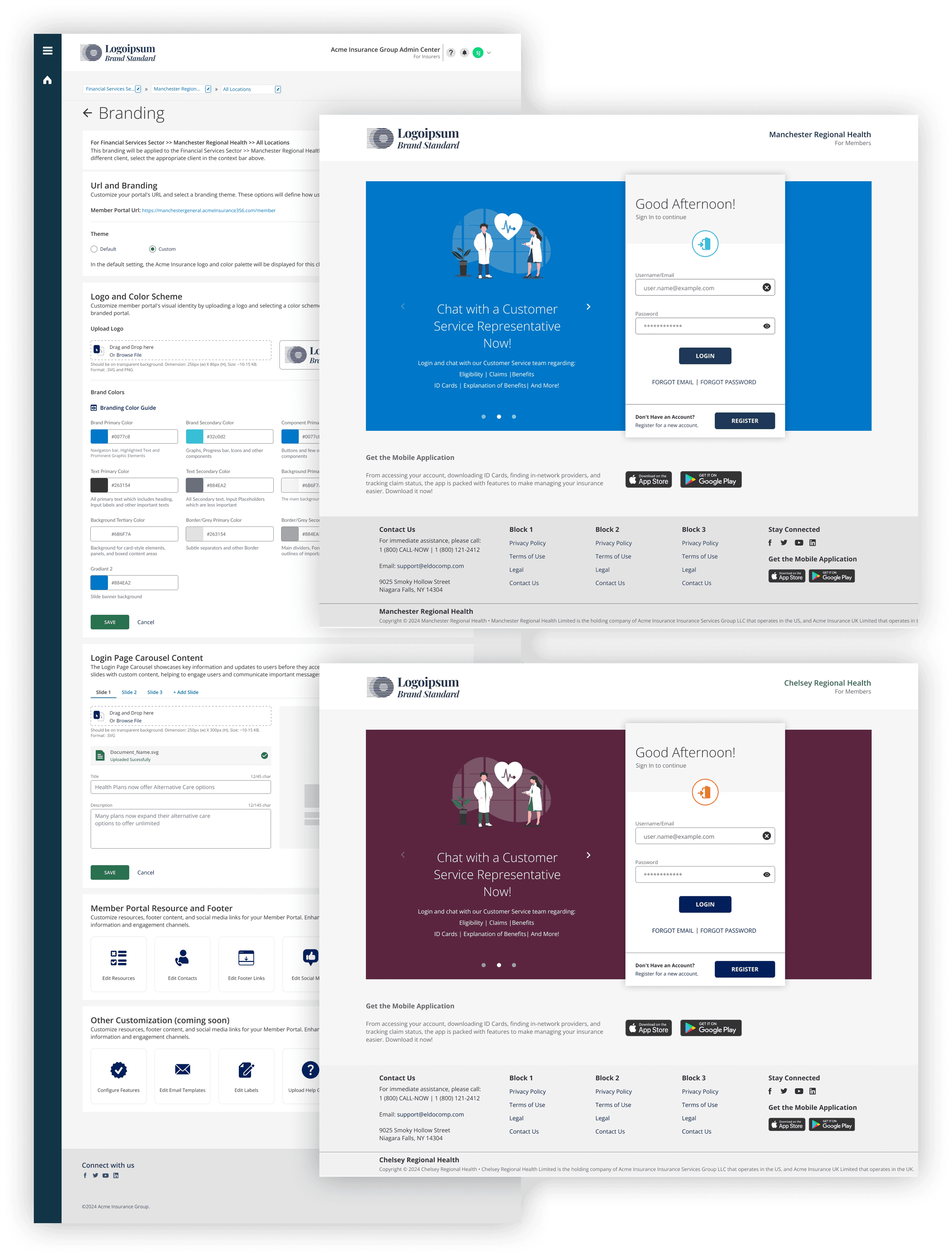
The first major decision was how to structure multi-brand theming. We had three realistic options: build separate codebases per client (fast to start, impossible to maintain at scale), build a single flat theme per client (simpler, but couldn't handle the Insurer → Employer → Member inheritance model), or design a token-based hierarchical system where each tier inherits from the one above and can selectively override.
We chose the hierarchical token system. The reasoning: Javelina's entire business model depended on selling the same platform to multiple insurers, each of whom sold it to multiple employers. Flat theming would mean rebuilding visual identity from scratch at every level. The three-tier model meant an insurer's brand lived at tier one, employer customisations at tier two, and member-facing UX at tier three, with inheritance flowing downward so changes at the top propagated automatically.
Decision 2: Token-based design system over component-first
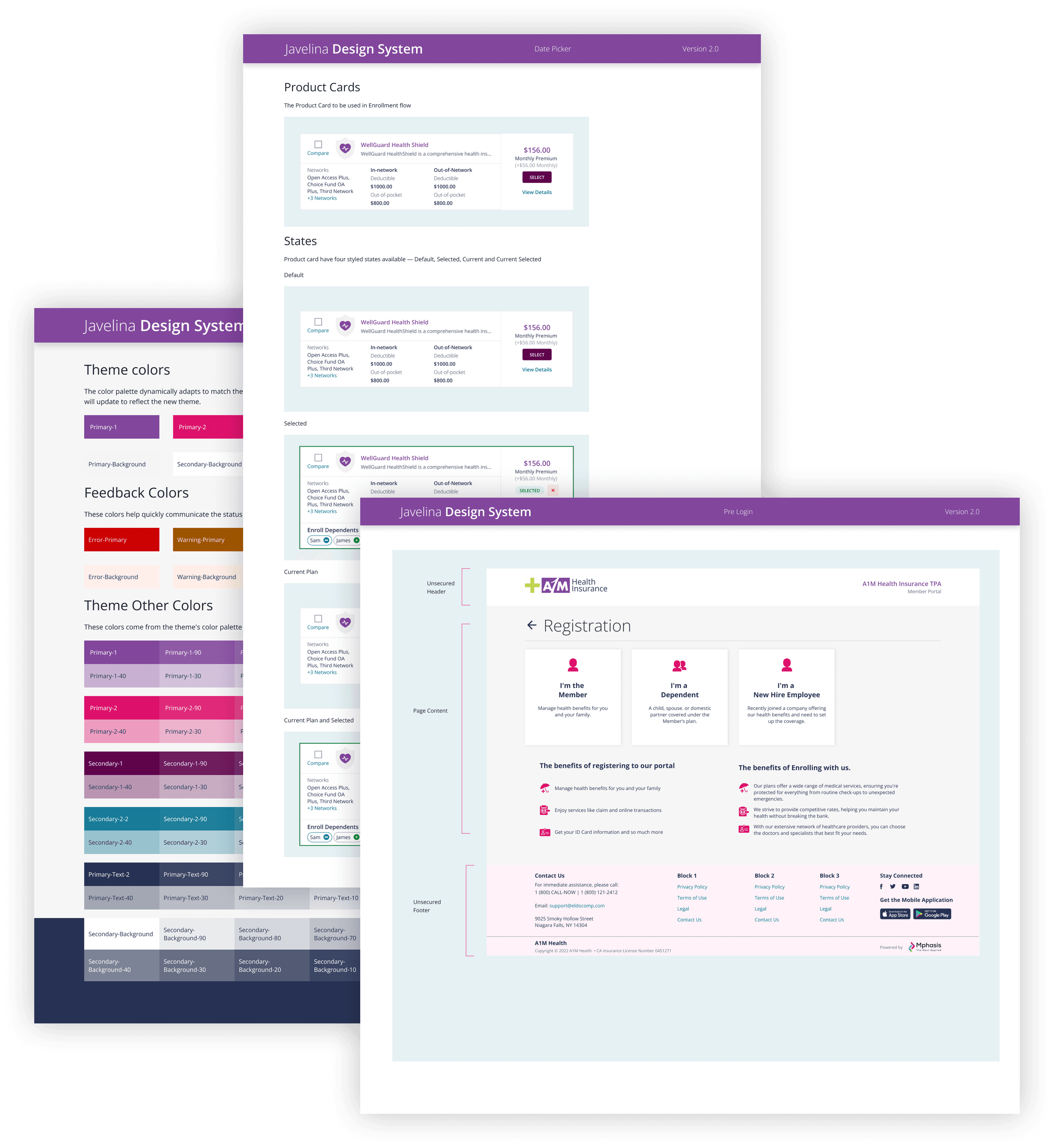
The conventional approach to design systems is to start with components: buttons, inputs, cards. We inverted this. We started with design tokens, the named values for colour, spacing, typography, and radius, before building a single component.
The reason was the multi-brand problem. If a button component has a colour hardcoded, you need a different button component for every client. If the button references a token, you change the token value and every instance of that button across every screen updates automatically. This decision is what made the under-24 hour client onboarding possible. Theme deployment became a token file change, not a development sprint.
The system reached 120+ components covering web, mobile web, and native iOS/Android, all drawing from the same token foundation.
Decision 3: Open Enrollment redesign structured around the member's mental model
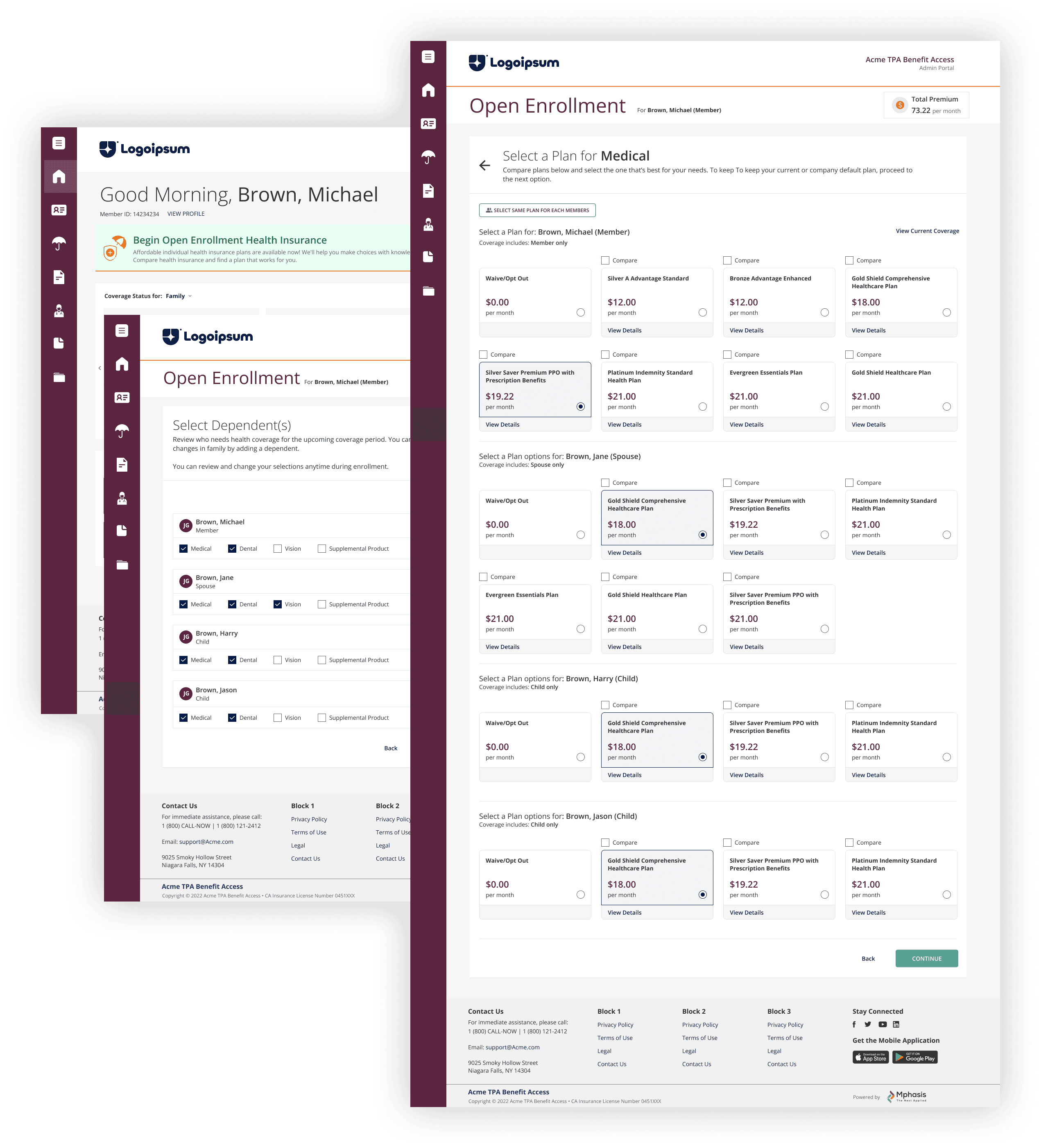
Open Enrollment, the annual window where employees select their health coverage, was the most critical flow in the product. When I audited it, it had 9 steps. The structure followed the system's data model: collect information in the order the database needed it, then confirm. No member thinks about health insurance enrollment this way.
The question we asked was: what decisions does a member actually need to make, in what natural order, and what are they cognitively ready to process at each stage? The answer restructured the flow entirely. We moved plan comparison earlier (before eligibility details, which members don't understand), collapsed three confirmation screens into one, and eliminated a document upload step that could be deferred post-enrollment.
The result was 5 steps instead of 9, a 44% reduction in enrollment steps at the most stressful moment of the member's interaction with the platform.
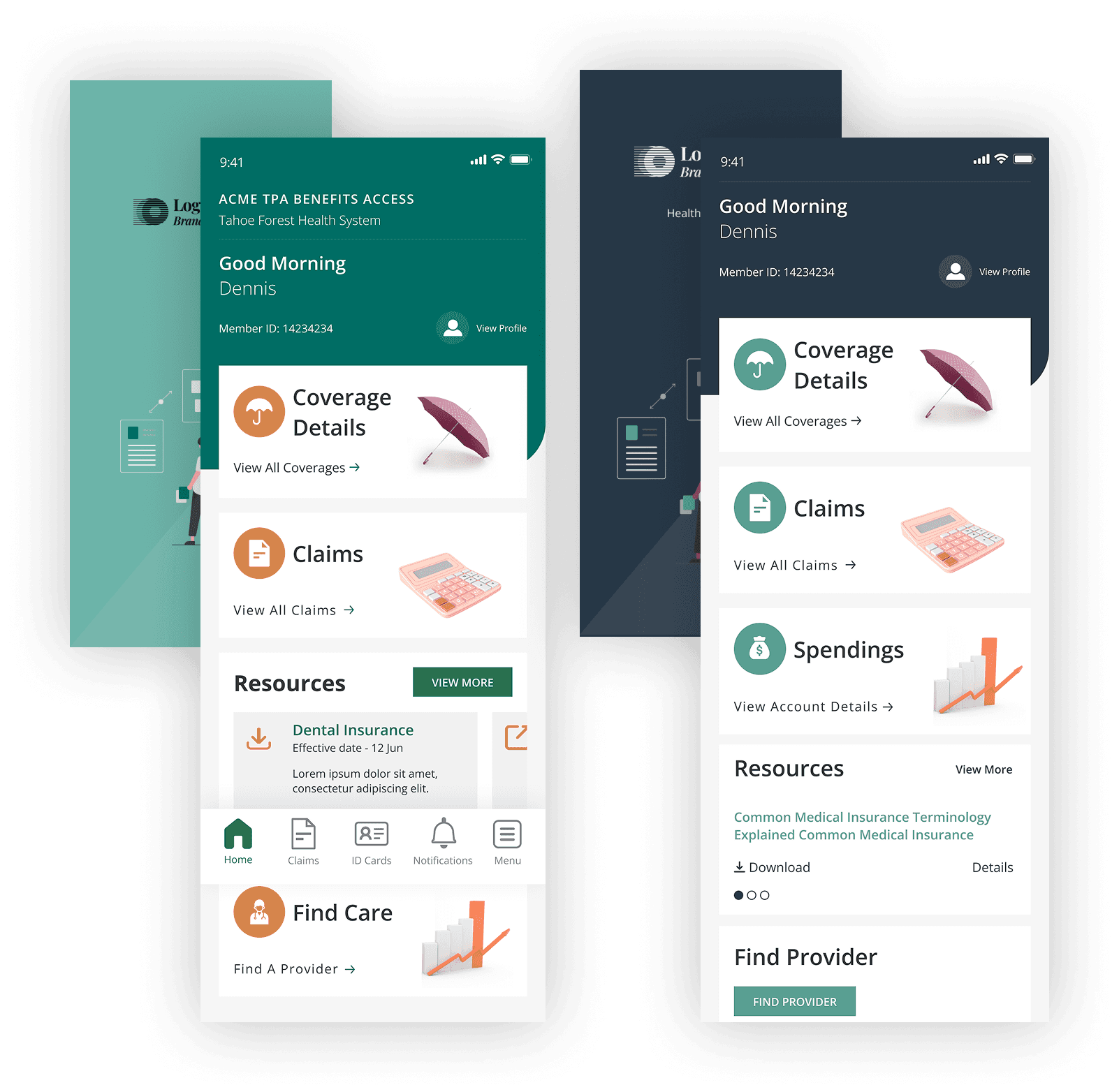
Decision 4: White-label mobile apps as design system extension
As insurer clients grew, the demand for white-label iOS and Android apps followed. The decision was whether to design the mobile apps as separate products or as extensions of the existing design system.
We extended the system. Platform-specific adaptations, including iOS navigation conventions, Android material patterns, and touch target sizing, were layered on top of the shared token foundation, not built from scratch. This meant the mobile components were born already themed for each client, and design consistency across web and mobile was guaranteed rather than manually maintained.
The alternative — custom mobile-specific components built independently — would have created a second theming system running in parallel. Every token change at the insurer level would have needed to be applied twice: once to web, once to mobile, by hand, with no structural guarantee they stayed in sync. Given that we were onboarding new clients under a 24-hour deployment target, that maintenance burden would have broken the model entirely.
Decision 5: Architecting a design operating system powered by AI
While Javelina's senior leadership was still in meetings debating whether to adopt Figma AI, I built something more useful: a design operating system that gave AI deep, accurate context about our white-label design system, and put it in the hands of every designer on the team.
The core problem with AI in design teams is context. A generic AI tool knows nothing about your component library, your token naming conventions, your layout constraints, or your client theming rules. Every prompt starts from zero. The output is plausible but wrong, wrong components, wrong spacing, wrong patterns for your system.
I solved this by building structured prompt libraries that embedded our design system knowledge directly into the AI's working context. A designer could reference a Jira ticket and the system would produce a relevant flow, screen, or component suggestion, grounded in our actual architecture, not a generic interpretation of what a health insurance screen should look like. The AI knew the difference between an insurer-tier component and a member-tier component. It knew which layout patterns were used for enrollment versus claims versus account management. It knew the token naming convention.
Beyond the prompt libraries, I built AI-assisted workflows for the team's three highest-friction tasks: design exploration (generating layout options before committing to a direction), annotation (drafting handoff notes from screen descriptions), and QA (flagging component usage that deviated from the design system). I also created a quality framework with explicit AI-assisted checkpoints, structured reviews at each stage that caught system inconsistencies before they became handoff problems.
The result: a 40% reduction in dev handoff time. Not because designers were working faster at the same tasks, but because the bottlenecks, including exploration dead-ends, annotation gaps, QA rework, were structurally reduced. The AI didn't replace design judgment. It eliminated the administrative overhead that was consuming it.
Loading Figma
AI with full design system context: components, tokens, layout patterns, and client theming rules.
Open in Figma ↗Results
- Dev handoff time reduced by 40%, achieved through an AI-assisted design operating system built before the organisation had formally adopted any AI tooling
- New client theme deployment reduced from weeks of manual development work to under 24 hours, enabled by the token-based design system
- Open Enrollment redesigned from 9 steps to 5, removing 44% of enrollment steps at the highest-stakes moment in the member journey
- Feature delivery standardised: 2 days design, 3 days development, a repeatable cadence that hadn't existed before the design system
- 120+ component library built and maintained across web, mobile web, iOS, and Android, used by a team of 4 designers and multiple development squads
- AI prompt libraries deployed across the design team, giving every designer AI tools with accurate context of our white-label system, not generic output
- Clients onboarded under this system: Cigna, Keenan, Bywater, and Aptia, all Fortune 500 or enterprise tier
- Design team built from zero: 4 designers hired, onboarded, and operating to shared AI-assisted standards by the time of my departure
What I'd do differently
I'd push for user research earlier in the enrollment redesign. We made the 9→5 restructuring based on logical analysis of the flow and stakeholder input rather than observed user behaviour. We got the right outcome, but the case for it rested on analysis and conviction rather than usability data — in a regulated product context, that's a gap worth closing before shipping. A round of testing on the original flow would have given us evidence to stand behind, not just a decision that turned out to be correct.
I'd also document the design system rationale more thoroughly from the start. The token architecture decisions were clear in my head and in team conversations, but not written down in a way that survived personnel changes. When new designers joined, the why behind structural decisions had to be re-explained verbally, which doesn't scale.